
Two MICR font standards
E-13B
The North American standard
- Blocky characters of uneven mass
- Ten digits and four symbols: Transit, Amount, On-Us and Dash
CMC-7
Used across much of Europe and South America
- Seven bars per character
- The spacing between the bars encodes the character
Why the shapes look like that. Each character is shaped so that it produces a distinct waveform as it passes a magnetic read head. A visually similar font not built to that specification produces the wrong waveform, and the item is rejected.
MICR stands for magnetic ink character recognition. Those four words describe the whole method, and almost everything else about check printing is detail about how to make them work reliably at volume.
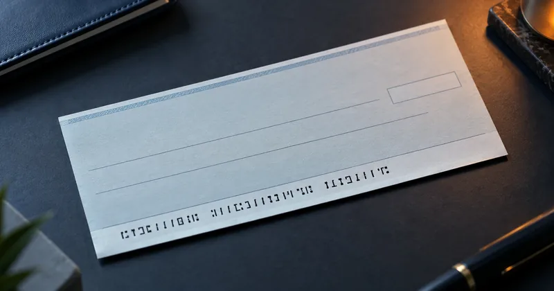
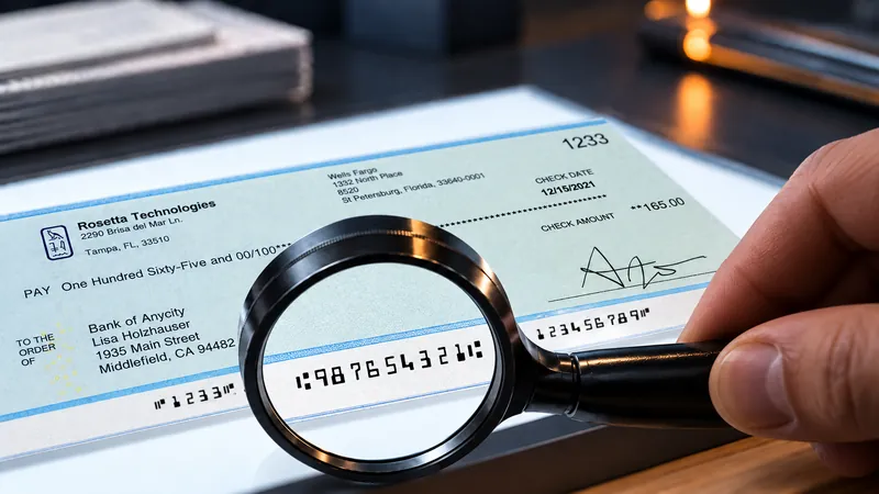
The line of characters along the bottom of a check is not printed for people. It is printed for a machine, in ink or toner that contains iron oxide, so that a reader/sorter can recover the digits magnetically instead of looking at them. A person can read the line, which is convenient, but legibility to a person is not what the process depends on.
That distinction is the reason the method has lasted. It is also the reason a check that looks flawless on a desk can still fail at the bank, which is a subject we return to often.
The read is magnetic, not visual
A reader/sorter magnetizes the ink on the MICR line, passes it under a read head, and compares the resulting waveform against the standard. The signal comes from magnetized iron oxide moving past the head. What the character looks like matters only insofar as the shape determines how the ink mass is distributed.
Consider what a check goes through between the day it is printed and the day it is cleared. It is folded into an envelope, carried through the mail, opened, endorsed, stamped, stacked, and handled by people who are not thinking about print quality. An optical read has to cope with all of that on the surface of the paper.
A magnetic read is looking at the ink itself rather than at the appearance of the page. That is a narrower question to ask of a piece of paper that has had a rough week, and it is why the magnetic method earned its place in high-volume clearing.
Two font standards, not one
There are two MICR font standards in use in the world. E-13B is the North American standard. It has fourteen characters: the ten digits and four symbols, named transit, amount, on-us, and dash. Every MICR line printed for a North American bank is built out of those fourteen shapes.
CMC-7 is used across much of Europe and South America. Its characters are drawn as seven vertical bars each, and the value of a character is encoded in the spacing between the bars rather than in an outline the way E-13B encodes it. Both standards solve the same problem, and they solve it in genuinely different ways.
The practical consequence is that the font is part of the specification, not a matter of preference. A font that resembles E-13B is not E-13B. Certified fonts are tuned to a specific print engine and a specific toner, because the engine and the toner determine how much ink actually lands on the page.
What the line carries
The MICR line is divided into fields, each delimited by symbols so the reader knows where one field ends and the next begins.
| Field | What it holds |
|---|---|
| Auxiliary on-us | Present on some items, positioned at the left of the line |
| Transit/routing | Identifies the paying bank, and carries a check digit |
| On-us | The account number, formatted as the bank specifies |
| Amount | Blank when the check is printed, encoded later by the bank of first deposit |
The amount field is worth dwelling on, because it surprises people who are new to check printing. You do not print the amount in the MICR line. The bank of first deposit encodes it after the item is deposited. Your print job produces a line that is deliberately incomplete.
Why banks still use it
The economics of check clearing are the economics of straight-through processing. An item that the reader/sorter can read moves through the system without a person touching it. An item it cannot read leaves that path and is handled by a person at the bank, and the bank charges for that handling at its own fee schedule.
So the value of MICR is not that it is elegant. It is that it holds a very high proportion of items on the automated path, across paper that has been folded, stamped, and mishandled, using a read that does not care about most of that damage.
For anyone printing checks, the working conclusion is simple enough. The MICR line is a machine interface with a published specification, and it should be treated with the same seriousness as any other interface where the other party charges you when the format is wrong.
What it takes to print one
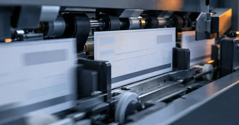
If the read is magnetic, then printing a check means putting magnetic material on paper in a controlled way. Three things are necessary for that, and all three are necessary together.
- Magnetic toner. MICR toner contains iron oxide, which is the material the reader magnetizes and measures. That iron oxide content is also why magnetic toner is black.
- Calibration verified on a MICR verifier. Signal strength is a property of the assembled machine rather than of the toner alone. The engine, the fuser temperature, the transfer roller, and the toner all contribute, so the machine has to be measured as a whole.
- Certified fonts. Certified E-13B or CMC-7 fonts, tuned to that print engine and that toner, so that the ink mass lands where the standard expects it.
Two of the three is not a partial result. A line printed with magnetic toner in an uncertified font reads perfectly well to a person and produces a waveform the standard does not describe. That item is not slightly harder to process. It is an exception.
And what the paper has to do
The paper takes part in the measurement as well, which is why check stock has a standard of its own. ANSI X9.18 governs it and is approved by the American Bankers Association.
Its requirements are 24 lb weight recommended, Sheffield smoothness of 120 to 150, moisture content of 4.5%, sealed moisture-proof wrapping, and paper containing no ferromagnetic material. The last requirement follows directly from the mechanism: the read head cannot separate a contribution from the sheet from a contribution from the toner.
Banks publish their own acceptable reject rate and their own fee schedule for items that fall out of automated processing. Ask your bank for both figures rather than assuming an industry norm applies to your account.