
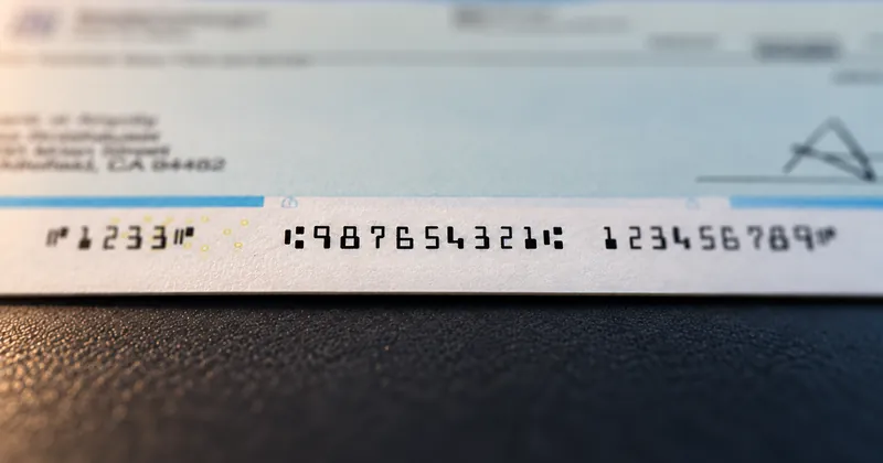
E-13B has fourteen characters (opens in a new tab): the ten digits, which carry the data, and four symbols named Transit, Amount, On-Us and Dash, which tell the reader/sorter where each field starts and ends. Every one of the fourteen is shaped to produce its own magnetic waveform. That, and not how it looks, is what each shape is for.
Most people who handle checks never look closely at the line along the bottom edge. Those who do usually notice two things: the digits are blocky and slightly odd, and four of the marks among them are not numbers at all. Both observations point at the same fact. The E-13B character set was designed for a machine first and a person second, and every odd detail in it serves the machine.
Shapes drawn for a read head
A reader/sorter does not look at a MICR character. It magnetizes the toner or ink, passes the line under a magnetic read head, and measures the amount of magnetic material passing beneath the head at each instant. As a character moves through, that measurement rises and falls, and the pattern it traces is a waveform. The machine identifies the character from the waveform, as we describe in how a reader/sorter turns a magnetic waveform into a digit.
That is why E-13B characters have square edges and deliberately uneven mass, thick in some places and thin in others. The uneven distribution of toner across a character is what makes its waveform different from the other thirteen. A smudge, a stamp or a signature crossing the line will confuse a system that reads shapes, but a magnetic read head reads through all of it, because it is measuring magnetic material rather than outlines.
The characters still look like numbers because people read the line too. A person checking an item can read the routing number by eye, which is the only reason the shapes resemble digits at all. So each character answers two readers at once: it has to be recognizable to a person, and it has to produce one specific waveform for the machine. When the machine cannot read what the eye can, the item is rejected, handled by hand at the bank and billed back to the issuer.
The ten digits carry the data
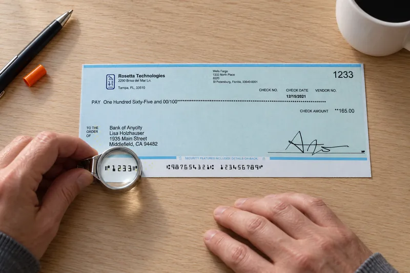
The digits 0 through 9 are the content of the line. On their own they mean nothing in particular. What gives a digit its meaning is the field it sits in, and the fields sit in fixed places. Those positions are counted from the right-hand edge of the document, the opposite of how a person reads the line.
On a typical business check, the digits fill these fields:
- Routing number: nine digits identifying the financial institution the item is drawn on. The ninth is a check digit calculated from the first eight.
- On-us field: the account number, and on many checks the check serial number as well. Its internal layout is set by the issuing bank rather than by the standard, so two banks can lay out the same information differently and both be correct.
- Amount field: blank when the check is printed, because a bank encodes the amount after the check has been written.
- Auxiliary on-us field: found mainly on business-size checks, at the far left of the line, most often carrying the check serial number. Personal checks frequently do not have one.
The check digit shows how much depends on reading every digit correctly. Because the ninth routing digit is calculated from the other eight, a reader/sorter can detect many misreads of that field on its own, which is why a routing error often surfaces as a rejection rather than as a misrouted item. The MICR line on a check, field by field sets out each field in full.
The four symbols carry the structure
The symbols carry no numeric value. They are structural. Each one marks the boundary of a field, so the machine can tell where one field ends and the next begins without counting characters.
| Symbol | What it marks | Where it sits |
|---|---|---|
| Transit | The routing number | On both sides of the nine routing digits |
| Amount | The amount field | On both sides of the amount, at the far right of the line |
| On-Us | The account portion of the line | Its exact use varies between issuing banks, and it bounds the auxiliary on-us field when there is one |
| Dash | A break inside a field | Most often within an account number |
Because the symbols bound their fields, a missing or misread symbol is worse than a missing digit. Lose a digit and the reader/sorter loses one character. Lose a symbol and it loses its place on the line. We go through how each symbol is used in the four MICR symbols explained.
Why a lookalike font fails
Since the shape is the specification, a typeface that merely resembles E-13B is not E-13B. A font drawn to be legible to a person, or a font file that happens to carry the name, can produce characters with the wrong mass distribution and therefore the wrong waveform. The output is legible to everyone in the finance office and wrong to the read head.
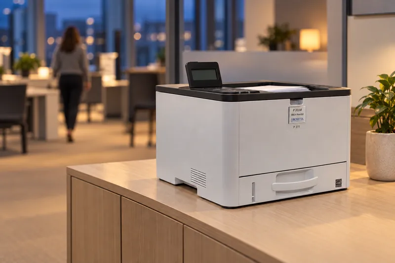
The font is also only one part of the waveform. Signal strength depends on the whole printer, not on the font file alone. That is why the three requirements for MICR printing travel together: magnetic toner, calibration verified on a MICR verifier, and certified E-13B or CMC-7 fonts tuned to that engine and that toner. Meet two of the three and the output looks right to a person and is rejected by a reader/sorter.
Our printers carry E-13B and CMC-7 fonts that we tune to each engine and its toner. Using our MICR fonts as supplied, rather than substituted font files, is one of the five conditions of the MICR Performance Guarantee.
What to check on the checks you print
- Ask your check printing supplier whether the E-13B font is licensed and tuned to the specific engine and toner, or a generic file that carries the name.
- Send your bank a printed sample on your real stock and ask them to confirm the on-us layout, since that field is set by the bank.
- Keep the reserved band along the bottom edge clear of everything except the MICR line, including background artwork.
- Watch the reject rate. A font or signal problem shows up there long before anyone can see it on the page.
If you would rather have a measurement than a guess, send us samples of the checks you print now. Our document evaluation measures the signal and the shape of each character, not just how the line looks. Keep the results: they are evidence of due diligence if your bank ever questions your output.
E-13B is the North American standard. CMC-7, used across much of Europe and South America, draws each character as seven vertical bars and encodes it in the spacing between them. Our printers carry both.